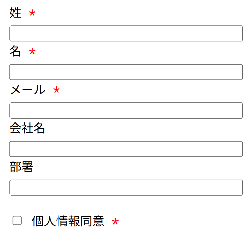
I have summarized information about the “required” mark in overseas screen UI (forms), along with UI guideline materials.
📌 Main Required Marks and Best Practices
Using an Asterisk (*)
- This is generally the most widespread method, adding “*” to required fields.
- However, an explanation such as “* indicates a required field” at the beginning of the form is essential (Nielsen Norman Group, California State University, Northridge).
- There are also examples that use color for emphasis (such as red text).
Clearly Stating “Required” or “(required)” in the Label
- By explicitly adding “Required” in text within the label, it can be clearly communicated to screen readers, improving accessibility (Deque).
Using ARIA Attributes or HTML5
requiredAttribute in Conjunction- In addition to visual indication, using
aria-required="true"or<input required>allows you to programmatically communicate that a field is required (Deque).
- In addition to visual indication, using
Clearly Stating Optional Fields Using “(optional)”
- There is also a method of explicitly indicating optional fields as “(optional)” instead of required fields, which is effective when both are mixed.
- However, Nielsen-Norman points out that “it is easier to judge if required fields are also explicitly indicated” (TPGi).
✅ Summary of UI Guideline Materials
| Source | Content |
|---|---|
| NN/g: Marking Required Fields in Forms | A combination of an asterisk + explanatory text is recommended, and showing only optional fields is evaluated as unfriendly (Nielsen Norman Group). |
| Deque (Anatomy of Accessible Forms) | - Use the string “Required” or an image within the label. - Explicitly states that suggesting by color alone is insufficient. |
| W3C Techniques (H90) | There are examples of including an asterisk or “(required)” in the label and defining the meaning at the beginning of the form. |
| TPGi (Doing what’s required) | Considering accessibility, evaluated that an asterisk + ARIA attribute + inserting label text is optimal. |
| Contensis UX Forms Guidelines | Briefly summarizes that consistent marking (* or (optional)) is important. |
✅ Recommended Implementation Approach
Add an explanatory text at the beginning of the form:
Fields marked with * are required. (Or collectively “All fields are required”, and if there are optional fields, “unless marked optional”)
Applying Labels:
- Write it like
First Name *orEmail (required).
- Write it like
ARIA Attributes / HTML5 Attributes:
1 2<label for="email">Email <abbr title="required">*</abbr></label> <input id="email" required aria-required="true">Do not rely on color alone: Support both visual and programmatic indications.
🔗 Reference Links (UI Guideline Materials)
- NN/g: Marking Required Fields in Forms (California State University, Northridge, Nielsen Norman Group, Deque)
- Deque: Anatomy of Accessible Forms (Deque)
- W3C Techniques: H90 Indicating required form controls (W3C)
- TPGi: Indicating mandatory fields accessibly (TPGi)
- Contensis: UX Forms Guidelines (Contensis)
If necessary, I can also provide specific HTML/CSS code examples, UI component design templates for Sketch/Figma, etc. Please feel free to consult with me!